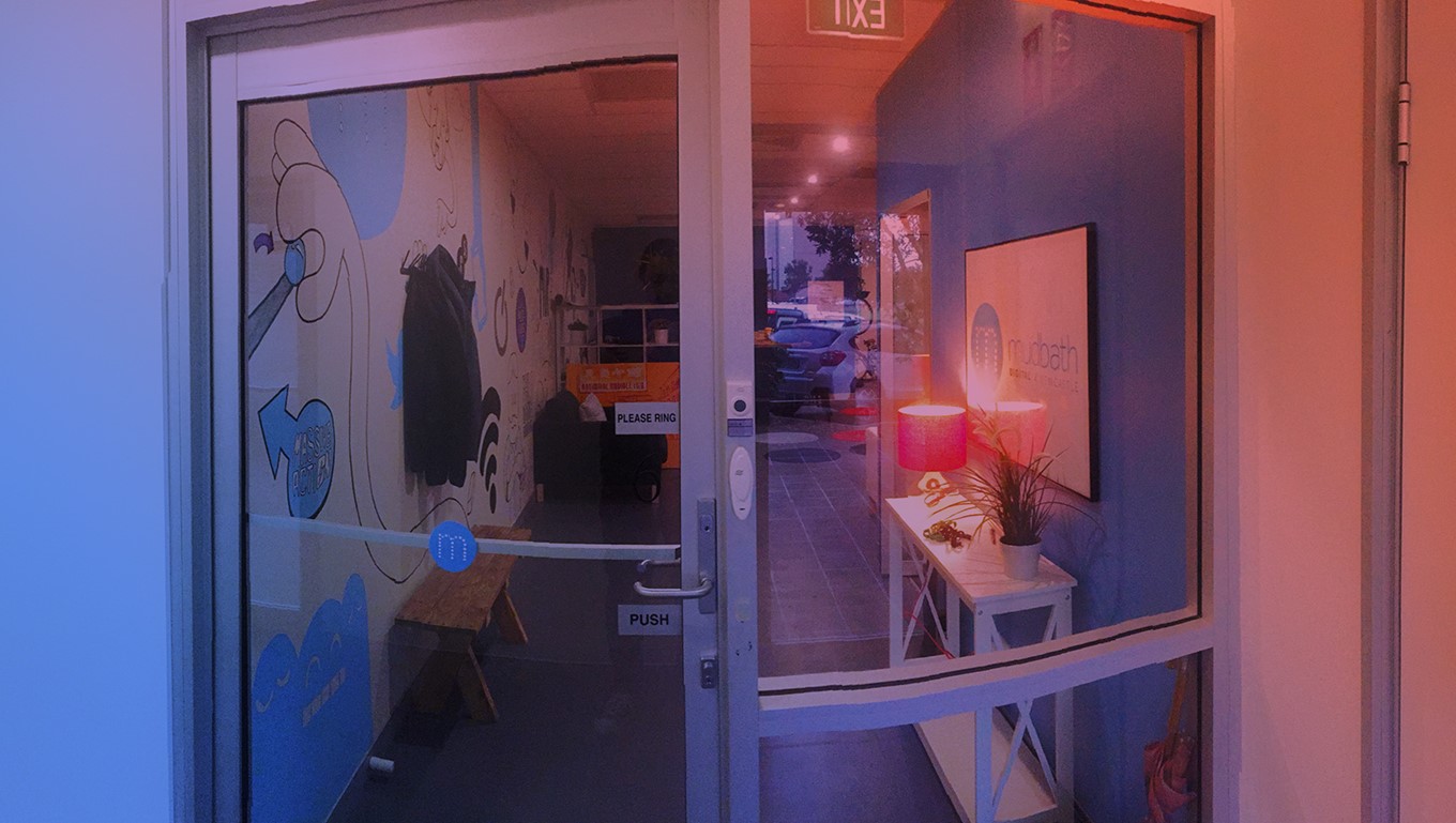
At Mudbath, like any office around the world, we have doors. And a few of them, but there is one door that gets on everyone's nerves.
This is the front door, possibly the most important door in any structure. When a user steps through a front door this is an emotional and physical transition between the outside world, which is an unforgiving uncontrollable environment, to a hospitable, calm and controlled environment (okay well at mudbath that calm and controlled section is not the whole truth when there are some tight deadlines).
This transition process should be a smooth and as comfortable as possible. But smooth is a bit of a buzzword, what does “smooth” mean? In the magical world of UX, I generally use the adjective as a quicker and more simple way of saying “lowest user cognition possible”. Essentially the process needs to be intuitive, non-restricting, and emotionally engaging.
But our front door at mudbath is none of these things. Once you walk through it a few times you learn how it wants you to interact with it. But ideally, a door should be an invisible barrier between the inside environment and the harsh outside world. Think of an automatic glass door, this door manages to achieve this transition while still achieving all the most common objectives of a door (but not without its faults). User interaction with an automatic glass door is nil. You don’t even need to think about how to interact with this door - it’s all AUTOMATIC! It just works when it needs to.
Our front door, however, doesn’t. The main issues with the door are a combination between tactile feedback and misleading information. When you attempt to open a door you look for the handle, then (you probably guessed the next bit) you turn the handle and either push or pull the door depending on what side you’re on (I don’t even want to start to go into doors that open the wrong way). But our doors handle doesn’t even turn, this leads the user to assume that the door is locked ‘cause that's how doors always work. Right? RIGHT!?!. Not our door, the handle is always in a static position whether it’s locked or not. The next thing the user does is look at the door, there are two conflicting signs on it. One at eye level saying “please ring the bell” and another below the handle saying “push”. So you guessed it the user rings the bell, and one of us happily gets up and lets them in.
Now you may be thinking to yourself “oh geeze Jake that's not too bad”. Well, you would be right, it’s not the biggest issue in the world. But every time the user returns to the door they still don’t understand how it functions and in fact, they can open it themself by simply just pushing on the door. I didn’t know I could open the door from the outside until someone told me.
So what’s the solution? Put in one of the fancy automatic glass doors you were talking about earlier? Nope, just keep it simple. When the door is unlocked just keep it open. I know this doesn’t achieve some of the goals of a door. However, it does openly welcome people into our space with no conscious effort. And if you can get a user achieving an action with very little to no conscious effort, then you have good UX design in your product.
If you want to put some UX thinking into your product (and not doors) then give us a call, email us, or hit us up on the live chat. Or if you just wanna talk about doors we can do that too.
Who knows, one day you might experience our poorly designed front door.


