Skip to Content
Prezzee allows users to send egreetings
The product

A minimum viable product launched to market from brief to delivery in 8 weeks

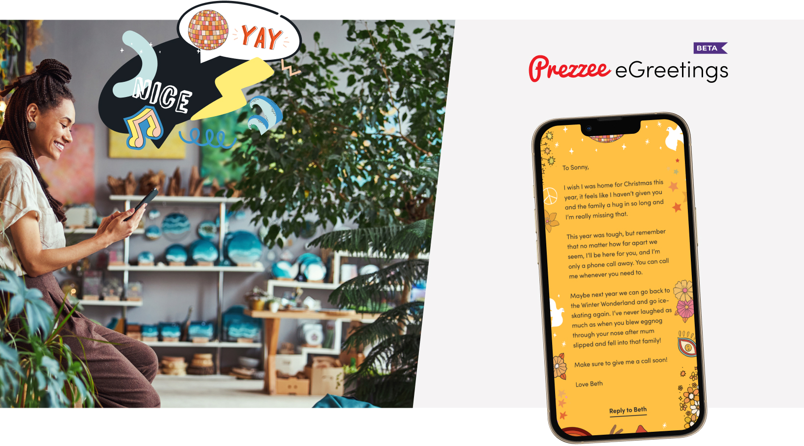
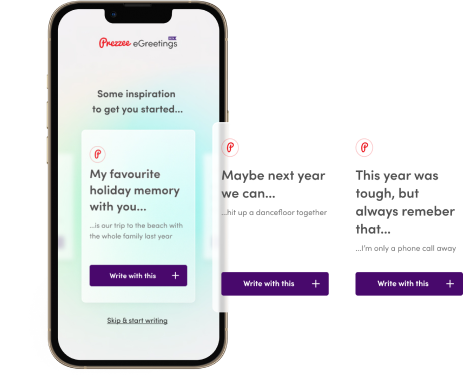
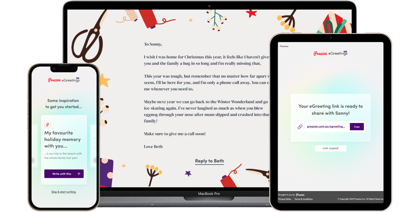
Mudbath’s brief was to create a human-centered eGreeting product that evoked an emotional connection between the sender and recipient. The platform offered emotional prompts and meaningful visuals to help senders find the right words and sentiment to express their feelings. Every colour, pause, prompt and transition was designed to contribute to a meaningful user experience.

In return, the eGreeting encouraged the person receiving the message to reciprocate and re-engage at a later stage, whilst holding as much emotional value as a physical card or product in the recipient's mind.

The eGreeting product formed the MVP of a suite of feature updates that were prioritised on a future roadmap including event based prompts, gift card integrations and audio and video messaging.

Outcomes
  • 1500 interactions in the first 2 months
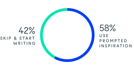
  • 42% inspired to create content through prompts
  • 50% completed end to end user journey
  • 37% sent an eGreeting in response

“The more I use the product, the more I want to use it so we've done something right. But more importantly, it has been an absolute pleasure to work with you all. Well done and I hope you all feel as proud as we are to share it with our customers.”

Benoit Garnaud Head of Product | Prezzee
An image of post-it notes and sharpies
Key insights

Communicating feelings is hard, our product made it easy

Through a series of ideation sessions which broke down the end-to-end process of sending and receiving cards, user pain-points and positive moments began to emerge. These areas were then validated against existing user research and a customer engagement piece, which formed the basis of the project.

The effort involved in writing on a card and the emotion attached to it provides the most value to the recipient.

Mudbath explored ways throughout the user flow to help the user recall moments that mattered to them and communicate that to their loved one. This brought effort, care and emotional connection back into the eGreeting experience.

Testing which prompts resonated with senders

Mudbath tested different emotional prompts and sentiments with consumers before landing on a final product design and user flow.

Design

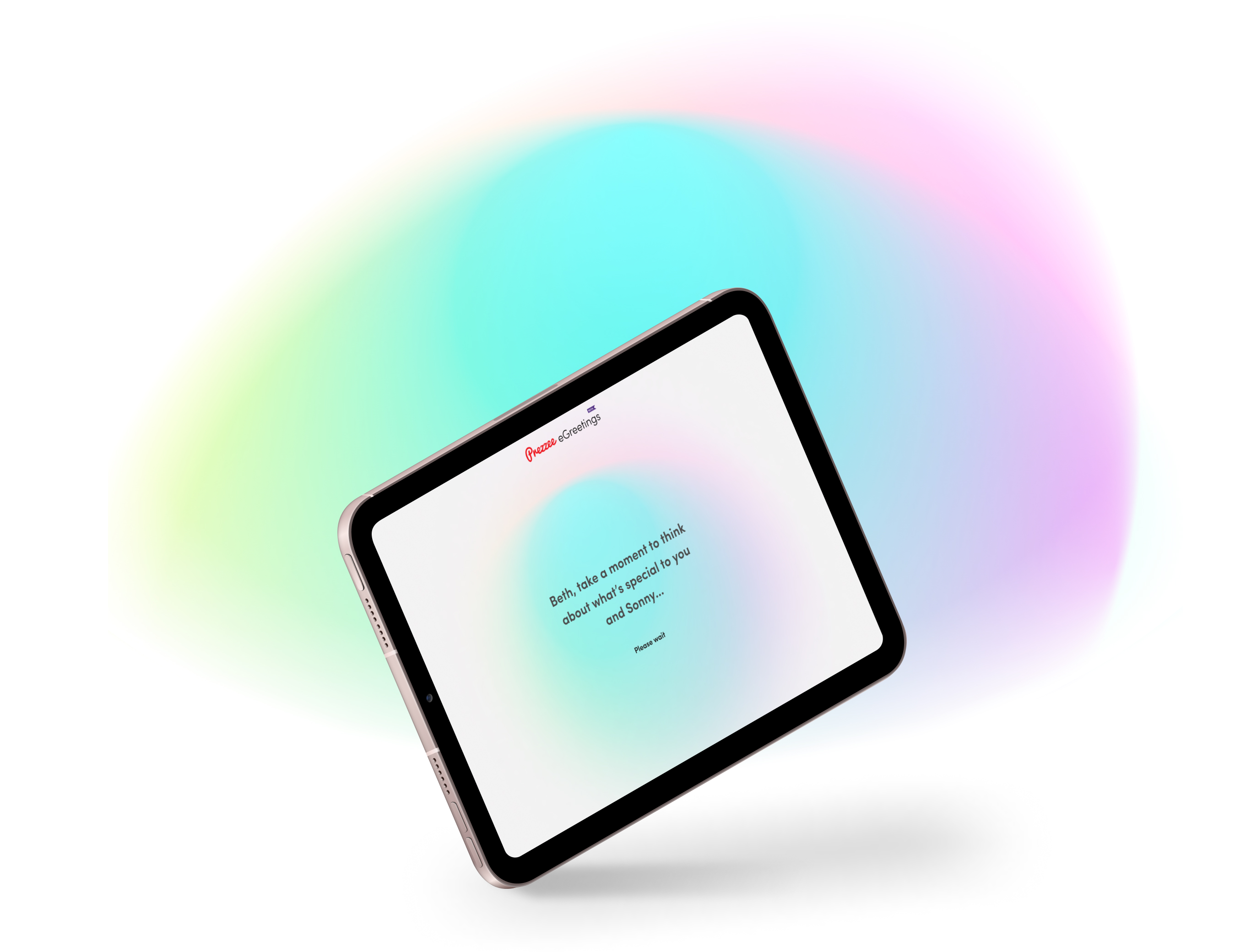
A space for contemplation

The look and feel of the product centred around ‘ambient mindfulness’ as it best supported the feeling of a contemplative space to capture meaningful messages. This direction involved more front-end investment to create a slow moving abstract animation, but it had the added benefit of being reusable throughout the entire product. Once chosen, the remaining interfaces were designed for mobile, tablet, and desktop screen sizes.

Ambient contemplation branding
Technology

Solution architecture

The product was designed to be highly visual requiring high front-end investment. This was achieved using a React framework due to its flexibility. A low-code tool called Retool provided the back-end administration that allowed content authors to update prompts and view existing messages without the need for a developer. This saved considerable development and design time as it easily connected to the SQL server.

Azure Functions was chosen as it’s a serverless product, which allows for fast response times from the API without having to manage the infrastructure. It also automatically scales the system when more requests are made. The site scaled up to 141 requests per second with 0 failures. This was a much more cost-effective solution for API hosting. The API Manager added security to the API through restricted IP addresses and throttle requests and offered a lot of extra features. Azure CDN allowed for incredibly fast delivery of the front end website whilst also minimising the cost of delivery.

These products combined meant that the backend build could be achieved within a short period while the other streams worked in parallel.

Azurefunctions
Microsoft Azure Logo
Retool Logo
Sql Logo
React Logo (1)
Segment Logo
Prezzee Api
Appveyor Logo
Launch

Engaging customers during the festive season

As the festive season is Prezzee’s most profitable quarter, rather than launching the eGreetings product to every customer, it was decided to launch it instead to dormant users with the goal of giving them a great experience to reinvigorate their relationship with the gift card brand whilst introducing a new beta product to test in market.

Prezzee responsive screens
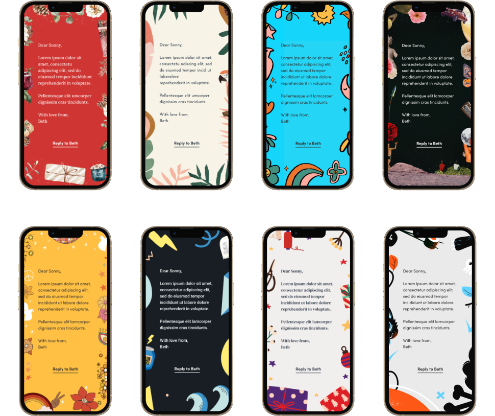
Multiple designs available to personalise the message